The Health Improvement Department strives to address health inequalities and improve the health and wellbeing of individuals and communities in Lanarkshire. Their programmes of work are focused around six public health priorities:
1. Vibrant, Healthy and Safe Places and Communities
2. Early Years/Children
3. Mental Health & Wellbeing
4. Tobacco, alcohol and drugs
5. Sustainable Inclusive Economy with equality of outcomes for all.
6. Nutrition, Healthy Weight and Physical Activity
To reflect its work, the team has worked on a new strapline; ‘Live Well Lanarkshire’.
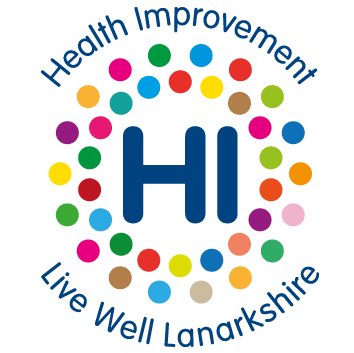
This new strapline also coincides with a modern and fresh new logo, and both represent the health improvement function and the wide range of work that the team are involved in to improve the health and wellbeing of our communities:

Alana McGlynn, health improvement programme manager, NHS Lanarkshire, said: “Our staff, partners and community are very much central to the approach that we used to develop the new Health Improvement brand. We consulted at all stages of the process and it was really important to us that the brand reflected the views of all our stakeholders. Having the communications expertise of Rachel Stewart, senior communications officer and the design experience of Derek, graphic designer, on our team really helped guide the process.
“From the feedback we received, we aimed to produce graphics and a strapline that was a clear representation of our function whilst also ensuring that it was positive, colourful, modern, non-judgemental and trustworthy.
“Thanks to everyone who engaged with us during the process, sent ideas for a strapline and voted for your favourite design at the end. We will continue to monitor the brand and ensure that it remains current and relatable to our stakeholders.”
Derek York, graphic designer, NHS Lanarkshire, added: “It was satisfying to develop the new logo since I’ve worked in Health Improvement for many years. The old graphics used on our social media didn’t properly represent us, so it was great to work on a new, cleaner brand that reflects the work we do.
“The new logo came from the idea of a ‘bird’s eye view’ of people gathered together, which represents us as part of the local community. I reduced that to two rings of dots – the inner one representing NHS/HSCP staff and the outer one for external partners/public. The rounded typeface matches the dots and helps make our initials look like a friendly greeting; saying ‘HI’!”
Kerri Todd, head of health improvement, NHS Lanarkshire, commented: “The team have done a great job in developing the new logo and consulting with our partners and communities to ensure it is inclusive and reflective of our aims. We wanted something that would work across the different online platforms as we know that’s how a lot of our communities want to receive information and I think we have achieved this. I am delighted to see it launched.”


